TL;DR
An equity curve is a graph showing the growth of a trading account over time. A smooth, upward-sloping equity curve indicates a consistent strategy. Equity curve analysis reveals drawdown patterns, strategy consistency, and can be used as a filter to pause trading during drawdowns.
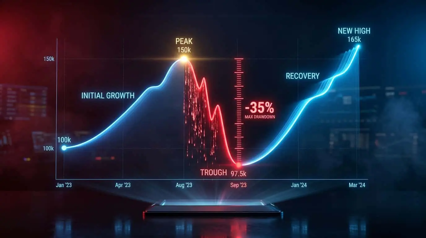
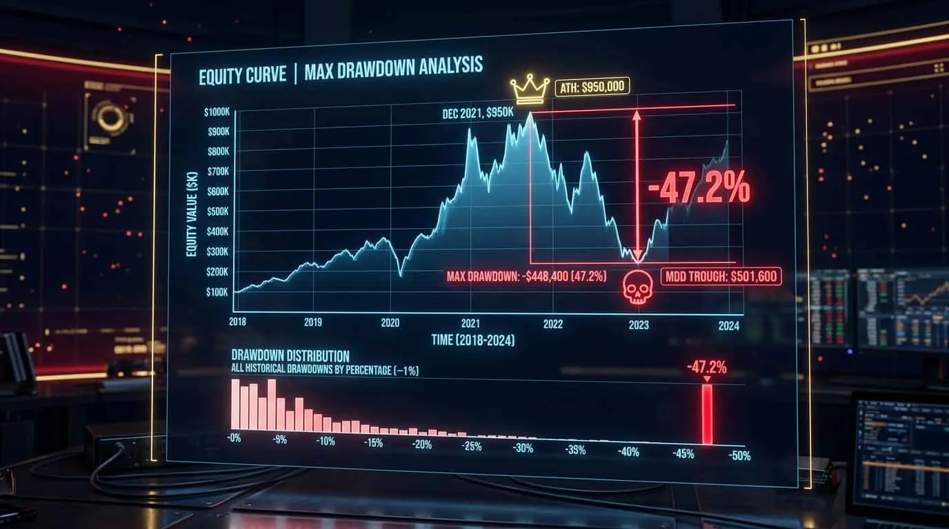
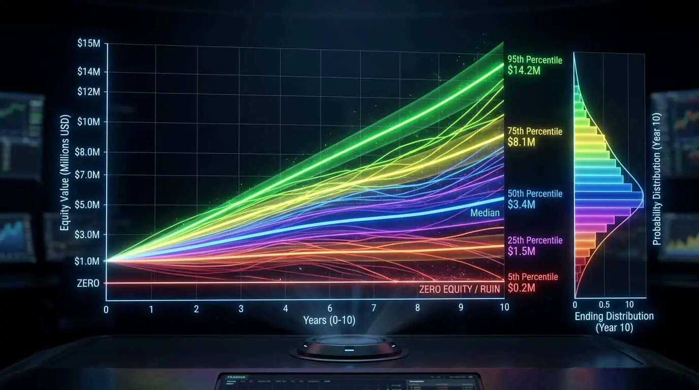
An equity curve is a graphical representation of a trading account's value over time, plotted as a line chart where the x-axis represents time (or trade number) and the y-axis represents account equity. Each point on the curve reflects the account value after each trade or at each time interval. The shape of the equity curve tells you more about a strategy's quality than any single performance metric. A smooth, consistently upward-sloping curve indicates a robust strategy with manageable drawdowns. A jagged, volatile curve with deep declines indicates an inconsistent strategy with high risk. Two strategies can have identical total returns but vastly different equity curves: one might grow steadily while the other swings wildly between gains and losses. Most trading platforms, including NinjaTrader's Strategy Analyzer, automatically generate equity curves as part of performance reports.
When analyzing an equity curve, look for several key characteristics. The slope represents the growth rate: steeper slopes indicate faster account growth. The smoothness indicates consistency: a smooth curve means steady performance, while a jagged curve means volatile results. Flat periods (plateaus) indicate breakeven phases where the strategy is not making or losing money, which may suggest the market is not favorable for the strategy. Sharp declines represent drawdown periods and their depth reveals maximum drawdown. The recovery speed after drawdowns shows how quickly the strategy returns to profitability. Compare the equity curve to a straight line from start to finish (the ideal growth path) to visualize how much the actual performance deviates from the ideal. Strategies whose equity curves closely follow a straight line have the most predictable performance.
Pro Tip
Plot your equity curve on a log scale rather than linear. On a log scale, consistent percentage returns appear as a straight line, making it easier to spot changes in performance. A curve that bends downward on a log scale indicates declining performance.
Equity curve filtering is an advanced technique where you use the equity curve itself as a trading signal. The basic concept is simple: if the equity curve drops below its own moving average, stop trading (or reduce size) because the strategy may be in an unfavorable market condition. When the equity curve crosses back above its moving average, resume trading at normal size. This filter acts as a meta-strategy that pauses the underlying strategy during its drawdown periods. Backtesting research shows that equity curve filtering can reduce maximum drawdown by 20-40% with only a minor reduction in total returns. The most common implementation uses a 20-trade or 50-trade simple moving average of the equity curve. If the current equity is below this average, skip the next trade or reduce position size. This prevents further deterioration during losing streaks and preserves capital for when the strategy returns to favorable conditions.
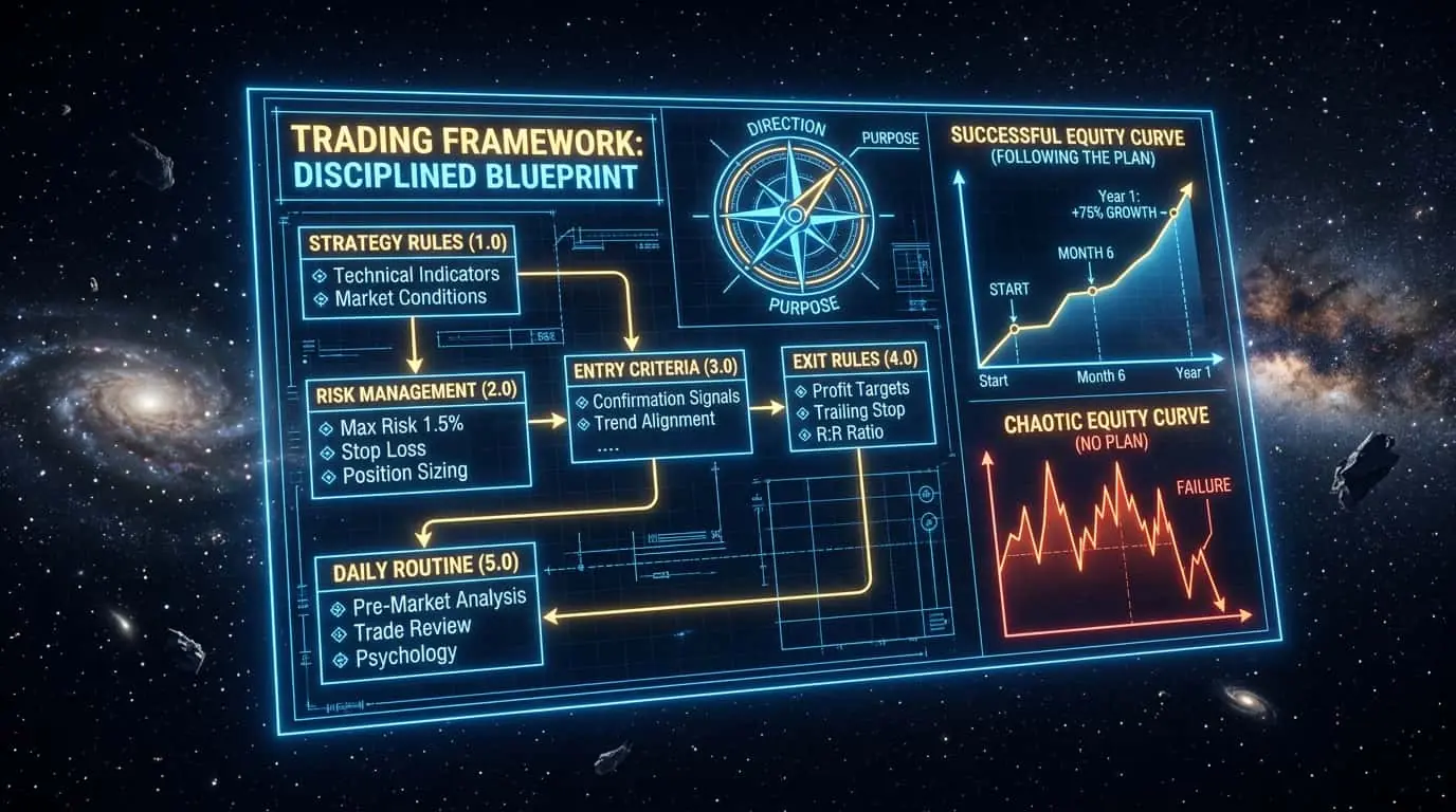
A healthy equity curve has several distinguishing characteristics: it trends upward over time with a consistent slope, drawdowns are shallow (under 15-20% of peak) and short in duration, recovery from drawdowns is relatively quick, and there are no sudden catastrophic drops. An unhealthy equity curve may show one or more warning signs: long flat periods indicating the strategy is breaking even or slowly losing, sudden sharp drops indicating blow-up risk, increasing drawdown depth over time indicating a strategy losing its edge, staircase patterns (flat periods followed by sudden jumps) indicating the strategy relies on rare events rather than consistent edge, or a final equity value near the starting value despite appearing profitable in the middle (indicating temporary luck rather than a genuine edge). When evaluating a strategy, always examine the equity curve alongside the numerical metrics. A strategy with impressive numbers but a poor equity curve should be treated with suspicion.
| Characteristic | Healthy Sign | Warning Sign |
|---|---|---|
| Slope | Consistent upward trend | Flat, declining, or erratic |
| Drawdowns | Shallow (under 15-20%) | Deep (over 25-30%) |
| Recovery | Quick return to new highs | Prolonged recovery periods |
| Consistency | Smooth, gradual growth | Jagged, volatile swings |
| Progression | Similar returns each quarter | All profit from one lucky period |
Beyond visual inspection, several quantitative metrics can objectively measure the quality of an equity curve. R-squared (coefficient of determination) measures how closely the equity curve follows a straight line. A perfect straight line (ideal equity growth) has an R-squared of 1.0. A jagged, volatile equity curve might have an R-squared of 0.5 or lower. Professional traders look for equity curves with R-squared values above 0.85, indicating that more than 85% of the curve's variation is explained by the linear trend (consistent growth) rather than random fluctuation. The MAR ratio divides the compound annual growth rate (CAGR) by the maximum drawdown. A strategy with a 30% CAGR and a 15% maximum drawdown has a MAR ratio of 2.0, which is excellent. A MAR ratio above 1.0 means the annual return exceeds the worst-case drawdown, and values above 2.0 are considered very strong. Below 0.5 suggests the risk-adjusted return is poor — you are enduring significant drawdowns for modest returns. The Ulcer Index measures the depth and duration of drawdowns by calculating the root mean square of percentage drawdowns over a given period. Unlike maximum drawdown, which captures only the worst single event, the Ulcer Index captures the cumulative pain of all drawdowns. A low Ulcer Index indicates a smooth equity curve with shallow, brief drawdowns. The Ulcer Performance Index (UPI) divides excess return by the Ulcer Index, providing a risk-adjusted return measure that penalizes strategies with prolonged or deep drawdowns more heavily than the Sharpe ratio does. These metrics should be used together for comprehensive evaluation. A strategy can have high returns and a good Sharpe ratio but still have a poor equity curve if the returns come from a few large, lucky trades. The R-squared, MAR ratio, and Ulcer Index reveal the consistency that single-point metrics miss.
MAR Ratio = Compound Annual Growth Rate / Maximum DrawdownCAGR — Annualized percentage return of the strategy
Maximum Drawdown — Largest peak-to-trough decline as a percentage
| Metric | What It Measures | Good Value | Excellent Value |
|---|---|---|---|
| R-Squared | Straightness of equity curve | > 0.80 | > 0.90 |
| MAR Ratio | CAGR / Max Drawdown | > 1.0 | > 2.0 |
| Ulcer Index | Depth and duration of all drawdowns | < 10 | < 5 |
| UPI (Ulcer Perf. Index) | Return per unit of drawdown pain | > 1.0 | > 2.0 |
| Calmar Ratio | 3-year CAGR / Max Drawdown | > 1.0 | > 3.0 |
Maintaining a real-time equity curve dashboard is one of the most powerful practices for monitoring trading performance and making informed decisions about strategy adjustments. A comprehensive equity curve dashboard should display several key elements. The primary equity curve plots your cumulative account value over time, with your benchmark (a straight growth line from start to current) overlaid for comparison. Below the primary curve, a drawdown chart shows the percentage decline from each new equity high, making it easy to see the depth and duration of every drawdown period. A rolling 50-trade equity curve moving average provides the signal line for equity curve filtering decisions. When the actual equity drops below this moving average, it signals that the strategy may be entering an unfavorable period. The dashboard should also display key metrics updated after every trade: current drawdown from peak, number of consecutive winners or losers, rolling 50-trade profit factor, rolling 50-trade win rate, and rolling 50-trade expectancy. Each of these metrics should have predefined alert thresholds. For example, if the rolling profit factor drops below 1.10, the dashboard displays a warning indicating possible edge degradation. If the current drawdown exceeds 75% of the historical maximum drawdown, it signals that the strategy is approaching dangerous territory. For NinjaTrader users, the Strategy Analyzer generates equity curves automatically for backtested strategies. For live trading, you can export trade data to Excel or Google Sheets and build a dashboard using simple formulas and charts. Several third-party trading journal services also provide automated equity curve dashboards that sync with your broker account. The discipline of reviewing your equity curve daily (or after every trade for active traders) creates a feedback loop that improves trading decisions. When you see the curve flattening or declining, you can proactively reduce position sizes before the drawdown deepens, rather than reacting emotionally after the damage is done.
Pro Tip
Export your live trading equity curve and overlay it on your backtest equity curve. If the live curve tracks within one standard deviation of the backtest, the strategy is performing as expected. If it diverges significantly below, investigate immediately — the strategy may be failing in live conditions.
Advanced traders use equity curve analysis to make decisions about when to activate, deactivate, or switch between multiple trading strategies. The core principle is simple: no single strategy works equally well in all market conditions. A trend-following strategy thrives in directional markets but loses money during range-bound periods. A mean-reversion strategy profits during consolidation but gets destroyed during strong trends. By monitoring each strategy's equity curve independently, traders can allocate capital to strategies that are currently performing well and withdraw capital from those that are underperforming. This approach is sometimes called regime-based strategy rotation. The implementation requires maintaining separate equity curves for each strategy (even if only in backtesting or paper trading mode for inactive strategies). When a strategy's equity curve crosses above its 50-trade moving average after a period below it, this signals a potential regime shift in its favor — consider activating or increasing allocation. When a strategy's equity curve drops below its moving average, consider reducing allocation or pausing it entirely. A concrete example: a trader runs three strategies simultaneously — a trend follower, a mean reversion system, and a breakout system — each on a $30,000 allocation ($90,000 total). After three months, the trend follower's equity curve is strongly above its moving average (trending market), the mean reversion system is below its average (losing in trends), and the breakout system is flat. The trader reallocates: $50,000 to the trend follower, $10,000 to mean reversion (reduced, not eliminated, to capture the eventual regime change), and $30,000 to breakout. This dynamic allocation, guided by equity curve signals, can significantly improve portfolio-level returns compared to static allocation. The key is to make these decisions mechanically based on predefined rules, not emotionally based on recent performance. Define the exact conditions for reallocation in advance and follow them consistently.
Mistake
Evaluating a strategy only by final return without examining the equity curve
Correction
Two strategies with identical final returns can have vastly different risk profiles. Always examine the equity curve for drawdown depth, recovery speed, and consistency before committing real capital.
Mistake
Ignoring the equity curve during live trading
Correction
Plot your live trading equity curve and compare it to your backtest. If the live curve deviates significantly from the backtest, the strategy may be failing. Use equity curve filtering to reduce risk during drawdown periods.